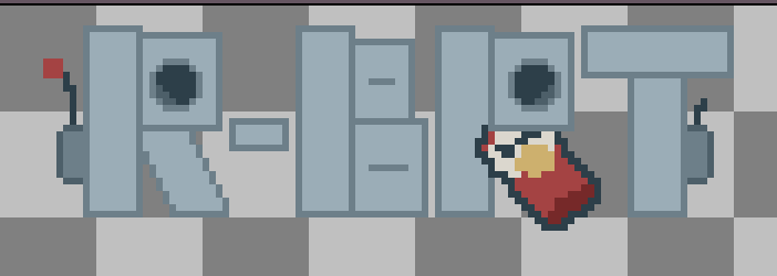
R-BRT
Dev Log 07: Designing UI
Hello everyone! Colby here again with Caffeine Rush. For today's Devlog, I will be explaining my thought process behind the UI design in our game R-BRT, along with the challenges and setbacks we faced.
Initial Design
The UI I chose to start with was the Dialogue UI, as I knew that I specifically wanted an image of S-4M bobbing up and down as he talks to you. I am not knowledgeable on creating 2D animations, so I went with a simple pixel-art, 4 frame animation, which I think looks good. In choosing pixel-art for the dialogue, I felt that the rest of the player's UI should also be pixel-art to stay cohesive.
Here is what that initial dialogue UI looked like, along with the initial ability images and the initial detection bar.

However, choosing pixel-art for a 3D game set in the future felt odd, which is where the problems arose.
Problem One - Consistency
Trying to stay consistent across the UI, I began to make a pixel-art title for our game, which wasn't completed but looked like this.
Upon receiving feedback from my teammates, I decided to pivot away from the pixel-art theme. I agreed with my teammates in that the pixel-art UI felt out of place in our game. So, instead of the pixel-art, I made clean and simple sprites along with a shader material to mimic holograms.
The new hologram UI turned out good, and also matches the games setting more than the pixel-art; but I wanted to keep the pixel-art dialogue, specifically for the animation. The main problem was, how can I keep the pixel-art dialogue while also having the futuristic UI throughout the rest of the game?
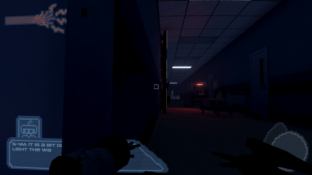
The answer I found for this problem was to put the scanline shader material onto all of the pixel-art UI. Here is the scanline UI plus the pixel-art UI with the scanline material.


Problem Two - UI Shader Materials
Creating a shader material for the UI was very tedious. Shader materials allow you to create moving textures, which can be very useful and can bring your game to life. However, shader materials for UI compared to 3D objects is very different. If you have attempted to create a shader for UI elements, you may have run into this problem.

The main problem above is the black boxes around all of the UI elements. The solution to this problem is changing the Render Mode from Screen Space - Overlay to Screen Space - Camera. I am not knowledgeable on why this is the solution, I would guess it has something to do with rendering the UI in front of everything, which possibly prevents the UI from being able to use transparency. When switching to Screen Space - Camera, a camera must be selected. After choosing a camera, the Canvas will move to match the cameras height and width, depending on the Plane Distance from the camera set.

This solution works great for the main menu of our game, but a problem occurs when doing this same technique for the players in-game UI.
Problem Three - Player UI
The old pixel-art player UI was already implemented into the game and was working fine; but to achieve a more cohesive look, these UI elements needed the scanline material. The only way for the scanline material to work is if the Canvas is set to Screen Space - Camera, easy fix right?
Well, there is a major problem with using Screen Space - Camera UI. Using this setting causes the Canvas to move into the game environment, which can cause clipping of the UI with the actual environment. That problem looks like this.
There are two solutions that I know of for fixing this problem.
- Solution One
This solution is quite the easy change, and more cost effective for performance. All that is required for this solution is to make sure that nothing in the world can physically get close to the in-world Canvas. This can be achieved by shrinking the Plane Distance number to fit inside of your players collider, which looks like this.

- Solution Two
The other option is to do what Screen Space - Overlay does manually, which is rendering the UI in front of everything else. This was somewhat tricky to figure out, as it requires a second camera with a certain setting. This is also why this solution is more costly performance wise, as having multiple cameras rendering at once is not necessarily something you want in your game.
R-BRT uses the second solution, as there is a different problem that forces us to use that solution. That problem is the fact that the player's arms stick outside of the players hitbox, which required a second camera to render the players arms in front. However, rendering the players arms in front causes the UI to render behind the arms, which is why we are rendering the UI with the same camera that renders the players arms, allowing both to be unable to clip with the environment.
Conclusion
Outside of those problems, the UI had no issues. There are a couple design choices that I have yet to mention, such as the moving main menu panel, but there was no particular reason for that choice besides me being inspired by the game Balatro.
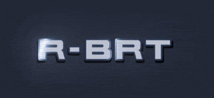
The metallic sheen on the R-BRT title was also inspired by Balatro, but I believe it works extremely well with our game. I did not want a holographic title for our game, as I felt that the title should be bold and easy to read. The issue with wanting an bold title is achieving a sleek design that matches the other UI, while also standing out. The metallic sheen allows for this, as it gives the fairly basic title some much needed identity.
Thank you for reading this far, and I hope you enjoy our game!
Leave a comment
Log in with itch.io to leave a comment.